 Ever wondered why your brand colours look different on your screen to your printed stationery and collateral? Below we explain the difference between RGB, CMYK and PMS colour so you can better understand what you’re looking at (and what we’re talking about!).
Colour is one of the more powerful yet subjective elements of design. With colour meaning and symbolism aside, it can sometimes be difficult to understand designer jargon on what it means to see colour on screen and in print. Before explaining the different systems of colour, it’s important to understand the basic science behind how colours are generated. The colours we see on physical objects such as printed documents are formed by mixing inks (CMYK), and the intangible colours we see on our screens are formed with beams of light (RBG). Presenting colour palettes to clients can sometimes be difficult to convey as designers, because what you see on your screen may look slightly different to what you will see when it’s physically printed – they are two completely different colour systems. We do our best to make sure screen and print colours are as possible.
Below are the colour wheels of RBG and CMYK colour systems. From a glance they may look the same, but if you look closely you’ll see they are actually opposite to each other.
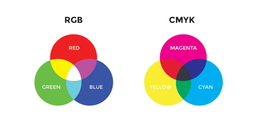
RGB
RGB stands for red, green and blue, and is the colour system that emits light to create the colour you see on screens.
RGB colours always look more vivid and bright on your screen than what you would see if you printed out the document or page (they are rays of light, after all!). This can sometimes create issues if you want your logo to look fluro or very bright when printed. The solution to this is to choose a PMS colour, which we will discuss later.
The other variable is screen consistency. Every screen or computer monitor will be slightly different depending on the quality and settings of your screen. Therefore what we see on our computer might be slightly different to what you see on your computer and also on your phone, etc. To make sure you are happy and confident with colour selection for print, it’s always best to choose colours from a physical swatch booklet – let us know if you’d like to drop in to see our swatches.
CMYK
CMYK is the most common colour system for printed materials, and stands for cyan, magenta, yellow and black. Mixing these 4 coloured inks forms a CMYK colour. In short, the process involves 4 coloured plates each printing small dots at different consistencies (think of your home office printer on steroids). CYMK is the most economic way of printing, but can sometimes be slightly inconsistent as the colours are mixed each time you print something different. To make sure your printing is as consistent as possible, we recommend sticking with one printer and choosing a paper stock you can use every time.
Take newsprint for example, the colour printed in a newspaper is always going to look different to the same design printed on a bright white paper. It’s the same principal if you were to print on a glossy paper and matt paper – there are hundreds of different paper stocks available and it’s possible that they may not look exactly the same each time depending on how the paper absorbs the ink.
Below shows the difference between CMYK and PMS – you can see that PMS will always be more vibrant. See below to learning about printing in PMS colour.
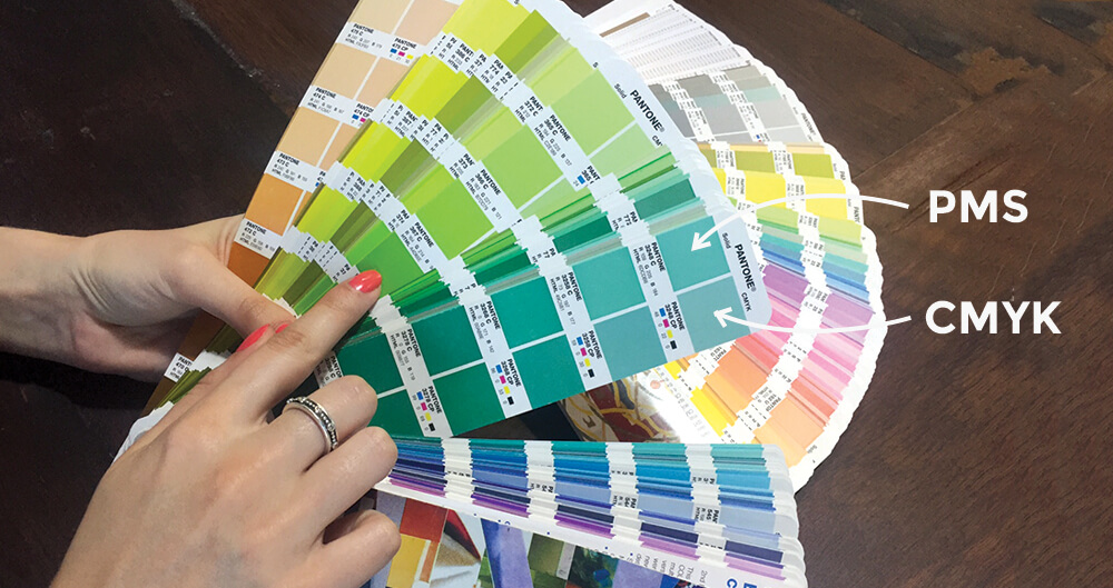
PMS
PMS stands for Pantone Matching system, also commonly known as Pantone colours, and is the most effective way of ensuring colour consistency on printed collateral. It is generally a more expensive way of printing, however the results are pretty spectacular.
Rather than mixing colours like CMYK, PMS have their own pre-made range of inks that you choose from their own swatch book. Designers favour PMS colours as we can be assured that your logo will print consistently every time.
PMS colours are more vibrant than CMYK colours, and will suit anyone wanting a very bright logo (similar to the result you may see on your screen when viewing RBG colours). If you’ve ever noticed a super bright printed graphic or printed item, it’s probably a PMS colour and part of a large run of copies/products. The downside is that it is quite expensive to print in PMS if your design is more than one or two colours or you don’t want many printed (>1000). Stationery is super effective when printed in PMS and will make your brand really stand out if your budget permits.
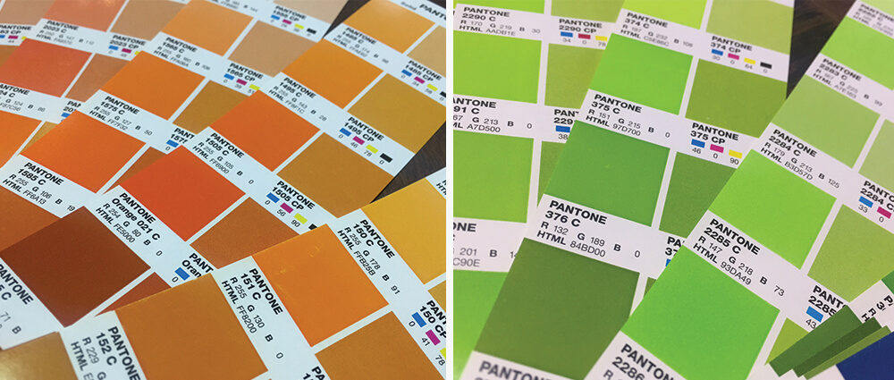
As can see above, PMS colours are the bomb and super vibrant (PMS left, CMYK right), but you pay for every additional colour you require, and is recommended for larger print runs.
We hope after explaining the principals and origins of colour that you will be more confident in choosing and understanding colours now!
We are here to help you make your next project look amazing! If you’re looking to move forward, drop us a line and schedule a call or meeting to talk all things creative.