Typography
Typography – it’s a whole world of serifs, sans serifs and slabs, and sometimes deciphering the terminology can be confusing. Here at Juno, we have created this guide to help you out with the A-Z of fonts. By the way, ‘typography’ is the family name, and ‘font’ is the style name, like Arial Italics or Arial Bold (note: we don’t use Arial). Learning more about the basics of typography will put you in good stead when it comes to knowing what’s right and not right for your brand (because who doesn’t appreciate good kerning when you see it).
Let us explain…
SANS SERIF
Sans serif literally means “without line”. Sans Serif typefaces are best used for headings and clean body copy. They are also great for the web, as they don’t have any small, pesky serifs that could pixelate and become hard to read on the screen. San serif typefaces are usually used in branding that resonates with a modern, bold look (think Adidas).
SERIF
Serifs are the small lines that tail the edges of a typeface. So why would you choose a serif typeface over a sans serif typeface, you ask? Serif typefaces are easier to read in large blocks of text (have a look at the book you’re reading), if you have to typeset a large document like a magazine the serif helps draw the eye across the text and creates a more readable document. They can also be an elegant choice if you are going for a timeless, sophisticated look (like Ralph Lauren).
SLAB SERIF
Slab serif typefaces are a chunky style of serif. The small edges that extrude from the slab serif are square and don’t taper off as much as a serif. Great for a bold, masculine brand, much like the Volvo brand.
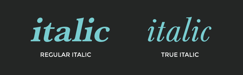
ITALICS
Italics is a style of font that slants to the right, most fonts will have an italic version to choose from. There are two types of italic; regular italic is when the typeface doesn’t have a specifically designed italic version, it will generally be a slanted version of the regular font. True italic is when a type designer specifically designs another version which is italic, this is a preferred italic to use as it has special flourishes and a polished look to it.
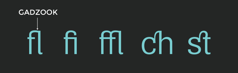
LIGATURES
Ligatures are relics from the past but they can look refined and beautiful when typeset in modern documents. In large documents ligatures can provide a beautiful touch to what could be quite a plain document. The most common ligatures are ff, fl, fi, ffi and ffl and although it looks like two characters joined together this is not the case, these characters are crafted to create 1 beautiful ligature.
Fun fact!
The “&” (ampersand) was originally a combination of the letters “e” and “t”, et, the Latin for “and”. However, the ampersand is no longer a ligature and is now a full blown member of the typography family. We’ve had our minds blown by this previously you can read the full article here.
TRACKING
Tracking is the space between all letters of a word, it should not be confused with kerning, as tracking is the spacing across the whole word and kerning is only applied to an individual letter. You can see in the example above that a letter tracked too tight becomes unreadable whereas a letter tracked too open can look too spacious. Some fonts allow for open tracking and can be a nice design feature although you have to very careful in choosing the right font to track out.

![]()
A few other important keywords in the world of typography are not so much to do with the actual letters, but the space between them.
KERNING
Kerning is our favourite typography tool and can transform a heading or logo text drastically. It’s absolutely critical that the letters are all balanced – uneven spacing makes for an awkward logo and a very unhappy designer.
Interesting tip!
To check the kerning is correct, flip the word you’re working with upside down and the spacing issues will stick out like a sore thumb – flip it back the right way and the spacing problem will seem less obvious.
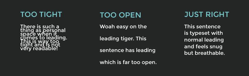
LEADING
Leading is the amount of vertical space between lines of text in a sentence. If a sentence has too much or not enough leading it can look like an un-loved peice of typography and can become unreadable, so the balance has to be just right between the letter height and the leading. As a general rule a good distance is 120% of the letter height, but this can depend on the length of your sentence.
The below are a few typographic terms so you can sound like a type whizz the next time you need to have a design conversation.
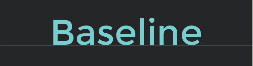
BASELINE
The baseline is the invisible line on which all typography sits. When looking at page layouts visualising this invisible line will help you get the alignment just right.
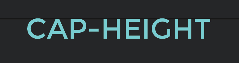
CAP-HEIGHT
The cap-height is the top of the capital letters.
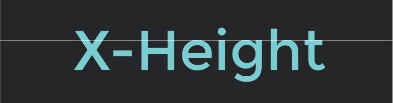
X-HEIGHT
X-height is the height of the lowercase letters.
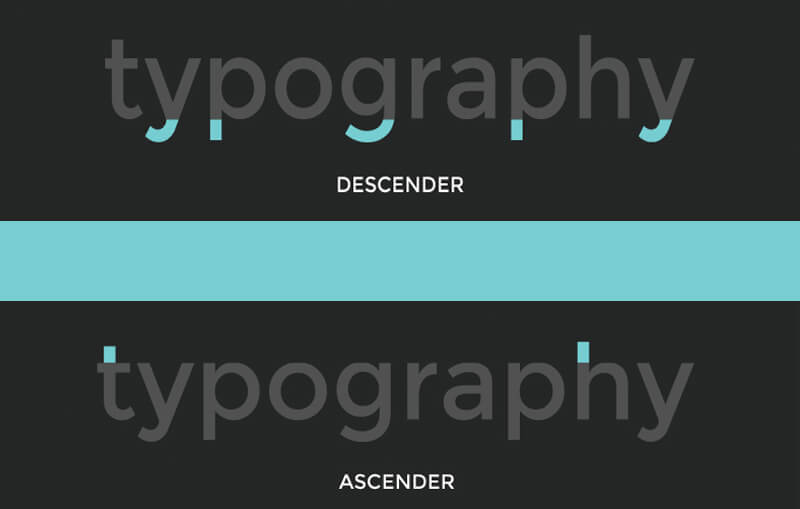
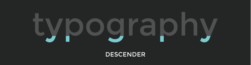
DESCENDER
Descender is the part of the letter which falls below the base-line. When type-setting you have to be careful to not let the descender touch the ascender of the text below – this is where choosing the perfect leading comes into play.
ASCENDER
Ascender is the part of the letter that extends beyond the x-height. When type-setting you have to be careful to not let the ascender touch the descender of the text above. If your leading is too tight the ascenders will touch (and not in a good way!)

A great resource for finding fonts is www.identifont.com. If you have a font in mind it will take you through the steps to identify a mystery font (and you can use your newly learned typography terms to help you find it!).